Good Reason

It's okay to be wrong. It's not okay to stay wrong.

Category: typography (page 1 of 3)

Daniel font rundown: Artistic edition!

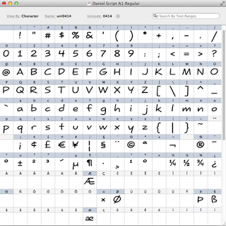
More people are using the Daniel font in a variety of creative endeavours.

Looks like I’m not the only one who uses my handwriting on cartoons. There’s also Bianca, who uses the Daniel font on her toons at Pushing Buttons. They’re funny!

Marianne has featured Daniel Bold on her site ‘apnea me‘, and boy, does it ever look tranquil. Watch out — you could float away, looking at this.

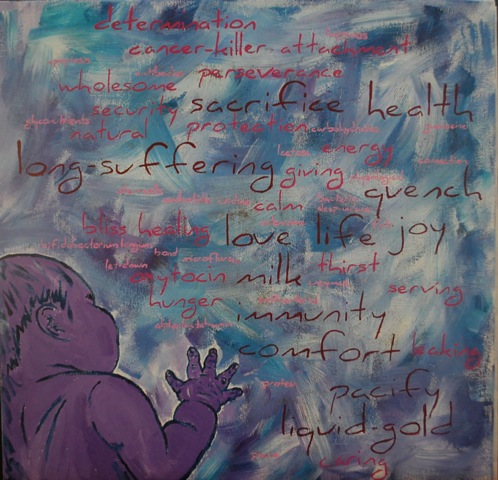
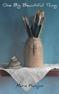
Artist Michelle Abernathy has used the font in a painting. She says:

About the piece: the title is Liquid-Gold, in acrylic on canvas. I am an advocate for physiological breastfeeding and this piece is all about how I felt nursing my oldest daughter and also about some of the amazing components in breastmilk. Now that she has a sister, I plan on doing a continuing piece to make a series.

Update: The series is done, and has been exhibited. Here are the artist’s comments.
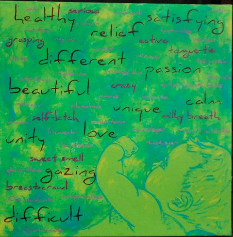
Liquid-Gold II

Acrylic

A depiction of my 2nd daughter, my current nursling.  The largest words describe my own thoughts and feelings about our nursing relationship, which has been surprisingly different from the first. The middle-sized words describe her personality as a nursling, as well as obstacles we faced or events unique to her. The smallest words are some of the awesome properties that scientists currently, and even very recently, have found in breast milk.
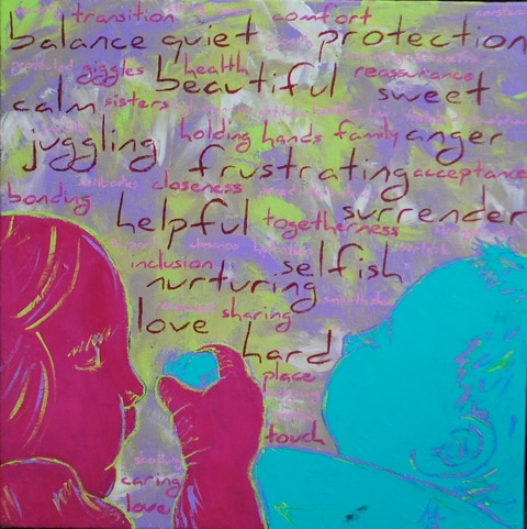
Double Gold

Acrylic

This painting pictures a unique nursing relationship, one very much less common in the Western world. The tandem nursing relationship. It captures one of my favorite aspects: sisters learning to love and share. The largest words describe some of my thoughts and feelings about tandem nursing, which has been quite a mixed bag. The middle-sized words describe the benefits of tandem nursing. And the smallest words describe the benefits of nursing a toddler/young child.

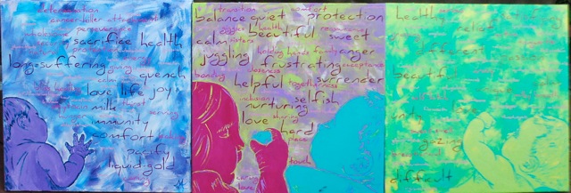
The Liquid Gold Series

Acrylic

Congratulations, and well done!

And elsewhere in the visual arts, Vincent Steenhoek shows the Daniel font in a theatrical work, where the words are projected onto the stage. Vincent was the video designer, and Alex Tintore is the photographer. I love it. Watch how the layers of type converge to make a garbled, almost suffocating wall of text.

Wow — thanks to all you creative people. I’m glad to be a part of your scene.

If you’ve used the Daniel font somehow, send me a photo or scan — email’s up the top — and you might see yourself here. You can always download my fonts from the Page of Fontery.

Daniel font rundown

My fonts are being used by some very creative people these days! Here are the highlights.

Here’s a logo that uses Daniel Black. It’s for the Red Mosquito Raceway, and it looks mighty sharp. (Geddit?) Nice work from Angela Panzica.

http://cargocollective.com/angelapanzica/Red-Mosquito-Raceway
https://www.facebook.com/red.mosquito.332

Ever wished you had an easy way of creating graphics in the ubiquitous Daniel font? Wish no more; the future is here. Thanks to Ryan Coons of RC Web Development.
http://fun.rcwebdev.co.uk/basicsgenerator/

And now a couple of books: First, it’s One Big Beautiful Thing by Marie Flanigan, cover art by Kristin.

Get it here: http://www.amazon.com/One-Big-Beautiful-Thing-ebook/dp/B00CM9K0PC/ref=sr_1_1?ie=UTF8&qid=1367517434&sr=8-1&keywords=one+big+beautiful+thing

Then there’s Vittoria Serena Dalton, who has used the Yataghan font to great effect on the cover of her book Unchanged: La Catena della Morte.

Here’s her GoodReads page. Scroll down for the book trailer. ¿Books got trailers now? Who knew.
http://www.goodreads.com/author/show/7104386.Vittoria_Serena_Dalton

For the rest of you who aren’t using my fonts, what’s stopping you? Certainly not the price, because they’re all freeeee from the Page of Fontery.

And if you’ve made something cool, send me an image! Email at upper right.

My fonts, large and small

The Daniel font is popping up everywhere!

Probably the biggest use of ‘Daniel’ to date appears at the entrance to CentroSicilia, a new shopping centre in Sicily, near Catania. Those Sicilians know style.

Notice that they’ve added a tab on the ‘n’, which is fine by me — a few people have added one of those.

http://www.centrosiciliashopping.eu/it/gallery

Elli is using the ‘Daniel’ font on all her fine work from Tigg Accessories — those double g’s are looking pretty sweet.

https://www.facebook.com/TiggAccessories

If you’re up for a game, try Semblance. It’s an interesting 2d mover with text that can form part of the game. I don’t usually sound as depressed as the text would indicate.

http://www.stencyl.com/game/play/13664

Lauren has used ‘Daniel’ on her Etsy site kindplush, and her designs are entrancing. I like the snail especially.

http://www.etsy.com/shop/kindplush

And then ‘Yataghan’ has made a few menacing appearances on books, once on Empire Zero by Bert Barling

http://www.amazon.com/Empire-Zero-Act-Tinder-ebook/dp/B0086XGG42/

and again on the cover of Mephistopolis by Keith Planit.

http://www.barnesandnoble.com/sample/read/2940016067148
http://www.amazon.com/dp/B00AZL8F56

If you’d like to get your hands on ‘Daniel’ (the font, not me) or ‘Yataghan’, or any of my other fonts, then head over to the Page of Fontery, where they’re all available for download.

http://goodreasonblog.com/fontery/

Thanks to all the creative people who have made great stuff with my fonts. If you’ve made something cool, tell me about it, and you might see yourself here.

Daniel font: The latest

I love seeing what people do with the ‘Daniel’ font. And here’s the latest:

Yvette from Unlimited People Coaching has placed it smack in the middle of their masthead, where it looks very fine.

Joseph Thiéry has featured it in his new e-book.

And if it’s fun you’re after, try it in the new app ‘Meany Birds‘. Good reviews, I see.

You can download the ‘Daniel’ font and feature it in your own projects on the Page of Fontery.

And if you’re a fan of the Daniel font, but you want a little more refinement, there’s good news: I’m working on retooling the font from top to bottom.

But what madness is this? I’ve also added Greek and Cyrillic support! 

I’ve never written in Greek! I don’t even know from Greek. Am I crazy? Perhaps! I’m so crazy, I just might add IPA support before I’m done.

It’ll be finished when it’s finished. But I thought you’d like to know.

Shape Type

The makers of Kerntype have made another typographic game: Shape Type.

When you’re making a font in a digital program like Fontographer, you spend a lot of time pulling the handles of Bézier control points around, trying to massage curves into a plausible letter shape. So can you drag the big pink circles to make a letter that looks good?

This one’s a bit harder than Kerntype — I managed an 86. Beat that, I dares ya.

Kerning: It’s not a game. Until now!

If you’ve ever looked at a sign, and said, “Well, that’s the crappest kerning job I’ve ever seen,” then I have a game for you.

What’s kerning, you ask? Moving letters around to get the spacing right. And now there’s Kerntype. It’s a game that will test your visual layout skills. Pull the letters around until they look good, and see how your kerning compares to expert opinion.

Get kerning, people. Beat my 98.

Yataghan: I feel so dirty

My Yataghan font has been ripping it up lately. Most recently, it’s appeared on the cover of “The Sword” by Daniel Easterman.

And it’s a featured download on PC World’s website. Kate Godfrey gives it a very kind review.

Midgley began his creation with a sketch of a lowercase ‘s’, followed by an ‘n’ that dipped below the baseline. Many reiterations later, the designer found himself with an impressive cast of characters including an owlish ‘o’ and a dagger of a ‘t’. To complete the look, he topped the font’s ascenders with a bone shape. Touché!

The ampersand is worth the download if only to experience the smart transition of centuries old weapon design into a believable text construction.

And to top it off, Yataghan makes a scarcely recognisable appearance on the website of Babylon Rising, which appears to be… a set of religious lectures?

This May, a four-night event called Babylon Rising will take a new look at the age-old controversy between Christ and Satan. From May 25-28, It Is Written’s new speaker/director, Pastor John Bradshaw, will host a timely, interactive series live from the Cashman Center in Las Vegas.

Oh, well. When I released the font, I knew there was a chance someone would use it for evil instead of for good. It’s the risk an artist takes.

Download Yataghan (and other fonts) from the Page of Fontery.

One space or two after a full stop?

Forget left and right wing, forget coriander lovers v haters. The real divide in our society is between the one spacers and the two spacers. And Slate’s restarted the war with this article: Space Invaders: Why you should never, ever use two spaces after a period

Two-spacers are everywhere, their ugly error crossing every social boundary of class, education, and taste. You’d expect, for instance, that anyone savvy enough to read Slate would know the proper rules of typing, but you’d be wrong; every third e-mail I get from readers includes the two-space error.

I’m a one spacer, and I’ll tell you why: Go to your bookshelf, open up any book, and look after any full stop. You’ll find one space. That’s how the pros do it.

Back in the days of typewriters, all the characters were monospaced, so an ‘m’ took up the same space as an ‘i’. A monospaced font will look like crap if there’s only one space after a full stop, so people were taught to use two. Nowadays, we have computers with well-designed typefaces, so you only need one space, as nature intended.

I can only see two reasons to use two spaces. Either you’re on a clanky old IBM Selectric, or you were taught to type by sadistic nuns who beat you if you forgot the extra space. The former can be cured with a computer, the latter with therapy.

More font sightings

My typefaces keep popping up.

Yataghan is still popular in the fantasy genre. I’ve just noticed that it’s been used for the UK editions of the Treason’s Heir series.

You can download Yataghan here.

And the Daniel font keeps going. It makes an appearance on a book jacket — The Jeremy – Snaps of the Dragon by Jo S. Wun. Click on the link above the main image to see the back of the jacket — that’s where the text is.

And Daniel Black is everywhere on the CanHaveGifts website. No, I mean, it’s all over the site — they’ve used CSS3 to include it as actual text, not graphics. Have a look!

You can download the Daniel font here.

UWA Atheist & Agnostic Society posters

At last, all the posters that have graced our fine campus this semester, and all in the one place. Collect the set!

Older posts

© 2024 Good Reason

Theme by Anders NorenUp ↑