More people are using the Daniel font in a variety of creative endeavours.
Looks like I’m not the only one who uses my handwriting on cartoons. There’s also Bianca, who uses the Daniel font on her toons at Pushing Buttons. They’re funny!
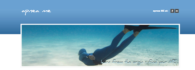
Marianne has featured Daniel Bold on her site ‘apnea me‘, and boy, does it ever look tranquil. Watch out — you could float away, looking at this.
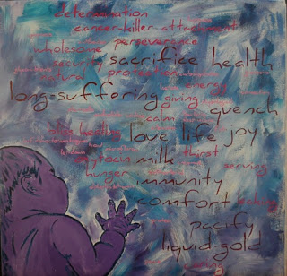
Artist Michelle Abernathy has used the font in a painting. She says:
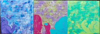
About the piece: the title is Liquid-Gold, in acrylic on canvas. I am an advocate for physiological breastfeeding and this piece is all about how I felt nursing my oldest daughter and also about some of the amazing components in breastmilk. Now that she has a sister, I plan on doing a continuing piece to make a series.
Update: The series is done, and has been exhibited. Here are the artist’s comments.
Liquid-Gold II
Acrylic
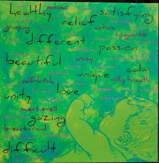
A depiction of my 2nd daughter, my current nursling. The largest words describe my own thoughts and feelings about our nursing relationship, which has been surprisingly different from the first. The middle-sized words describe her personality as a nursling, as well as obstacles we faced or events unique to her. The smallest words are some of the awesome properties that scientists currently, and even very recently, have found in breast milk.
Double Gold
Acrylic
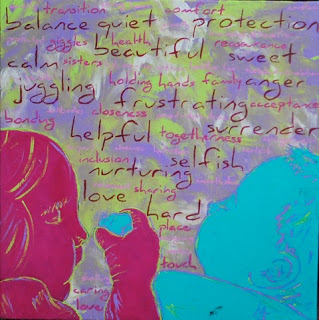
This painting pictures a unique nursing relationship, one very much less common in the Western world. The tandem nursing relationship. It captures one of my favorite aspects: sisters learning to love and share. The largest words describe some of my thoughts and feelings about tandem nursing, which has been quite a mixed bag. The middle-sized words describe the benefits of tandem nursing. And the smallest words describe the benefits of nursing a toddler/young child.
The Liquid Gold Series
Acrylic
Congratulations, and well done!
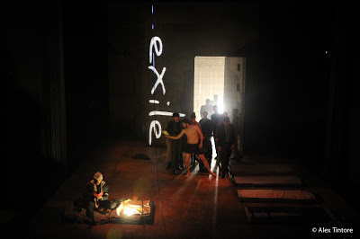
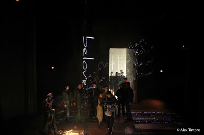
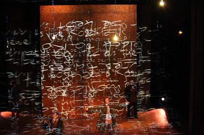
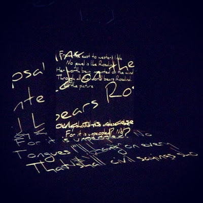
And elsewhere in the visual arts, Vincent Steenhoek shows the Daniel font in a theatrical work, where the words are projected onto the stage. Vincent was the video designer, and Alex Tintore is the photographer. I love it. Watch how the layers of type converge to make a garbled, almost suffocating wall of text.
Wow — thanks to all you creative people. I’m glad to be a part of your scene.
If you’ve used the Daniel font somehow, send me a photo or scan — email’s up the top — and you might see yourself here. You can always download my fonts from the Page of Fontery.

Recent Comments