Good Reason

It's okay to be wrong. It's not okay to stay wrong.

Category: typography (page 2 of 3)

It’s all about the shoes

While walking the streets of Seattle last month, I was pleased to find that Shoefly has used the Daniel font for their logo and design. Notice how they’ve cleverly used the ‘oe’ digraph for their name.

Now I’m realising that I’d never seen my handwriting in neon before. Very nice.

A brief typographic tour of Collins St, Melbourne.


Yataghan appears on cover of Dragonmaster

Usually it’s the Daniel font that gets all the attention, but another of my fonts has been popping up lately — Yataghan. It’s gothic and snaky.

Yesterday at the bookstore, I noticed that they decided to use it for the Omnibus edition of Chris Bunch’s book, Dragonmaster. I must say, it looks quite imposing in all caps like that. And the review quote — ‘a banquet of blood and thunder’ — looks suitably dagger-like in the lower case.

You’re welcome to download Yataghan and use it for anything you want. Just try not to harm anyone, okay?

Yet another use for IPA characters

How do you type upside-down on your keyboard? No, the answer is not to turn your laptop over. If you have a Unicode-compatible system, you can use this link. It converts what you type into equivalent upside-down characters, many of them from the International Phonetic Alphabet.

˙ǝןdoǝd ǝsnɟuoɔ puɐ ɥʇɹoɟ oƃ ʍoN ˙sʞɹoʍ ʇı ʇnq ‘ʎʞuoʍ ǝןʇʇıן ɐ s,ʇI ˙sıɥʇ ǝʞıן sʞooן ʇI

‘Daniel’ font sighting: Scott Murphy for Congress campaign

Scott Murphy is running for Congress in District 20 in the great state of New York. Not only is he a Democrat, and therefore one of the good guys, his campaign clearly has very discriminating taste.

Download the Daniel font for free from dafont.com.

Atheist bus font

Last week was taken up by a happy event: Ms Perfect and I moved into our new home. That meant getting all the furniture in, tracking down the right hedge trimmer (so as not to obscure the white picket fence), and getting the utilities hooked up. Now the Internet Drought is over, and I’m back online.

We here at Good Reason like to keep up with everything typographical, so when we found the Atheist Bus typeface, it was too good not to share. Here it is: Dirty Headline, the very same font used on atheist buses in England (and atheist t-shirts elsewhere), downloadable for free thanks to dafont.com.

Making your own atheist slogans is now a simple matter. Maybe you like the current one, but you think it lacks a little punch. Why not try pumping up the volume?

Now that’s a spicy meatball.

Rejected Obama logos

I’m a terrible logo designer, but I still like a good one. So I was pleased to find this entry on Logo Design Love about logos that the Obama campaign decided not to use. Pretty interesting to see how things could have been.

Daniel font sighting: Baywatch!

The Daniel font (download here) has been sighted yet again, this time on the cover of the Australian editions of the Baywatch DVD.


No, not that ‘Baywatch’ logo — it’s those small black letters that say ‘season 2’, etc. Sorry the photo’s so crap; it’s difficult to take a good picture from a mobile phone when you’re all excited.

Here’s the spine view.


I’m so proud.

‘Good Shepherd’: good design

I like to point out good typography and design when I see it, and I’ve developed a man-crush on the poster for the film ‘The Good Shepherd’. It’s been popping up on bus stations around Perth, and it’s a masterful piece of work.

I don’t mean this poster, which is running in the USA:


although it’s good too. Notice how dramatic whitespace can be.

Here’s the Australian one, flattened for landscape orientation.

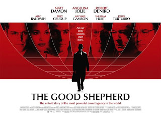
The first thing is the typography. They’ve used Optima, designed in 1959 by the inimitable Hermann Zapf. It’s simple, clean, unassuming, and perfect for the time in which the film was set.

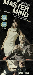
Second is the globe with the actors’ faces. This kind of international look was all over the place in the 60s and 70s. It’s very UN. For some reason it reminds me of the original cover on the box of the game ‘Mastermind’.


But back to the poster.

Again, the whitespace is easy on the eye, though the effect is more pronounced for the portrait version.

Overall, the poster looks global, sophisticated, and commands attention without being garish. It’s perfectly in keeping with the mood and time of its subject matter. Just a nice piece.
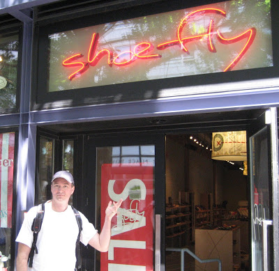
Another ‘Daniel’ sighting

The ‘Daniel’ handwriting font has been spotted in the opening titles for ‘The Sarah Jane Adventures’, the new Doctor Who spinoff.

Commentor ‘dobbins’, I hope you are duly impressed, since you introduced me to the Dr all those years ago, and now this.

My handwriting looks rather good floating through space. They’ve added the top bar on the ‘J’ and a spur on the ‘n’, but that’s the font, all right. Seems everyone modifies it, which is fine, but it could mean I need to take it back to the workshop for some refinement.

Let’s see. I’ve done movies, books, posters, and now TV. Where will my handwriting turn up next? Life on earth is an adventure, indeed.

h/t to Trenchcoat Steve

Older posts Newer posts

© 2024 Good Reason

Theme by Anders NorenUp ↑