Good Reason

It's okay to be wrong. It's not okay to stay wrong.

Category: Daniel font (page 2 of 2)

Daniel font: Words in the clouds

Word It Out offers a way to make frequency-based word clouds based on word lists or web pages. And they’re using the Daniel font, so you can see your text in my handwriting.

Here’s a word cloud based the words appearing on Good Reason as of yesterday.

"Good Reason"
Click on the link above to see this word cloud at WordItOut. You may also view it on this website if you enable javascript (see your web browser settings).

Word cloud made with WordItOut
Gee, I blog about religion a lot, don’t I?
More font sightings

My typefaces keep popping up.

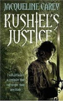
Yataghan is still popular in the fantasy genre. I’ve just noticed that it’s been used for the UK editions of the Treason’s Heir series.

You can download Yataghan here.

And the Daniel font keeps going. It makes an appearance on a book jacket — The Jeremy – Snaps of the Dragon by Jo S. Wun. Click on the link above the main image to see the back of the jacket — that’s where the text is.

And Daniel Black is everywhere on the CanHaveGifts website. No, I mean, it’s all over the site — they’ve used CSS3 to include it as actual text, not graphics. Have a look!

You can download the Daniel font here.

It’s all about the shoes

While walking the streets of Seattle last month, I was pleased to find that Shoefly has used the Daniel font for their logo and design. Notice how they’ve cleverly used the ‘oe’ digraph for their name.

Now I’m realising that I’d never seen my handwriting in neon before. Very nice.

Daniel font sightings

It’s fun to stay at the YMCA, but if it’s the Quebec YMCA, there’s an extra bonus: they use the Daniel font on their website. I think my handwriting looks quite nice in French.

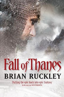
If you’re a fan of fantasy, you can find Yataghan on the cover of ‘Fall of Thanes’ by Brian Ruckley. In fact, it would appear to have been used on all three books in the “Godless World” trilogy. Now there’s a title I can get behind, although I hope he doesn’t mean that in a godless world there’s constant combat and it’s always cold.

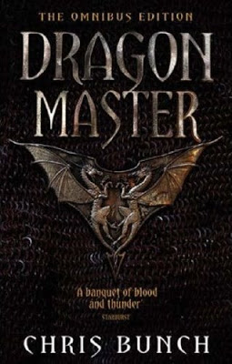
Yataghan appears on cover of Dragonmaster

Usually it’s the Daniel font that gets all the attention, but another of my fonts has been popping up lately — Yataghan. It’s gothic and snaky.

Yesterday at the bookstore, I noticed that they decided to use it for the Omnibus edition of Chris Bunch’s book, Dragonmaster. I must say, it looks quite imposing in all caps like that. And the review quote — ‘a banquet of blood and thunder’ — looks suitably dagger-like in the lower case.

You’re welcome to download Yataghan and use it for anything you want. Just try not to harm anyone, okay?

‘Daniel’ font sighting: Scott Murphy for Congress campaign

Scott Murphy is running for Congress in District 20 in the great state of New York. Not only is he a Democrat, and therefore one of the good guys, his campaign clearly has very discriminating taste.

Download the Daniel font for free from dafont.com.

Daniel font sighting: Baywatch!

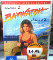
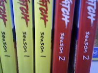
The Daniel font (download here) has been sighted yet again, this time on the cover of the Australian editions of the Baywatch DVD.


No, not that ‘Baywatch’ logo — it’s those small black letters that say ‘season 2’, etc. Sorry the photo’s so crap; it’s difficult to take a good picture from a mobile phone when you’re all excited.

Here’s the spine view.


I’m so proud.

Another ‘Daniel’ sighting

The ‘Daniel’ handwriting font has been spotted in the opening titles for ‘The Sarah Jane Adventures’, the new Doctor Who spinoff.

Commentor ‘dobbins’, I hope you are duly impressed, since you introduced me to the Dr all those years ago, and now this.

My handwriting looks rather good floating through space. They’ve added the top bar on the ‘J’ and a spur on the ‘n’, but that’s the font, all right. Seems everyone modifies it, which is fine, but it could mean I need to take it back to the workshop for some refinement.

Let’s see. I’ve done movies, books, posters, and now TV. Where will my handwriting turn up next? Life on earth is an adventure, indeed.

h/t to Trenchcoat Steve

Font fame

That ‘Daniel’ font pops up in the strangest places. It’s my handwriting font that I created long ago, and released to the web.

‘Daniel Bold’ now appears as the title font on the poster for a major motion picture. The film is “48 Shades“, an adaptation of the Nick Earls book.

It takes a lot of people to put a movie together, and I like to think I’m just doing my part. You can download the Daniel font from dafont.com.

Newer posts

© 2024 Good Reason

Theme by Anders NorenUp ↑