
 That ‘Daniel’ font pops up in the strangest places. It’s my handwriting font that I created long ago, and released to the web.
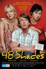
‘Daniel Bold’ now appears as the title font on the poster for a major motion picture. The film is “48 Shades“, an adaptation of the Nick Earls book.
It takes a lot of people to put a movie together, and I like to think I’m just doing my part. You can download the Daniel font from dafont.com.
12 August 2006 at 3:03 pm
Wow, I didn’t know you designed fonts too? Any other surprises?
13 August 2006 at 8:51 pm
This is toomuch fun Dan. I think the best part for me is that I think I actually recognise that script from highschool. You did use it freehand didn’t you?