
I have just received an advertisement in the mail, if you can call a beautifully bound book an ‘advertisement’. The ad’s for Zlota 44, a residential skyscraper that is soon to tower over the Warsaw skyline. The folks at EuroRSCG Marketing have chosen my handwriting typeface ‘Daniel’ for the body text.
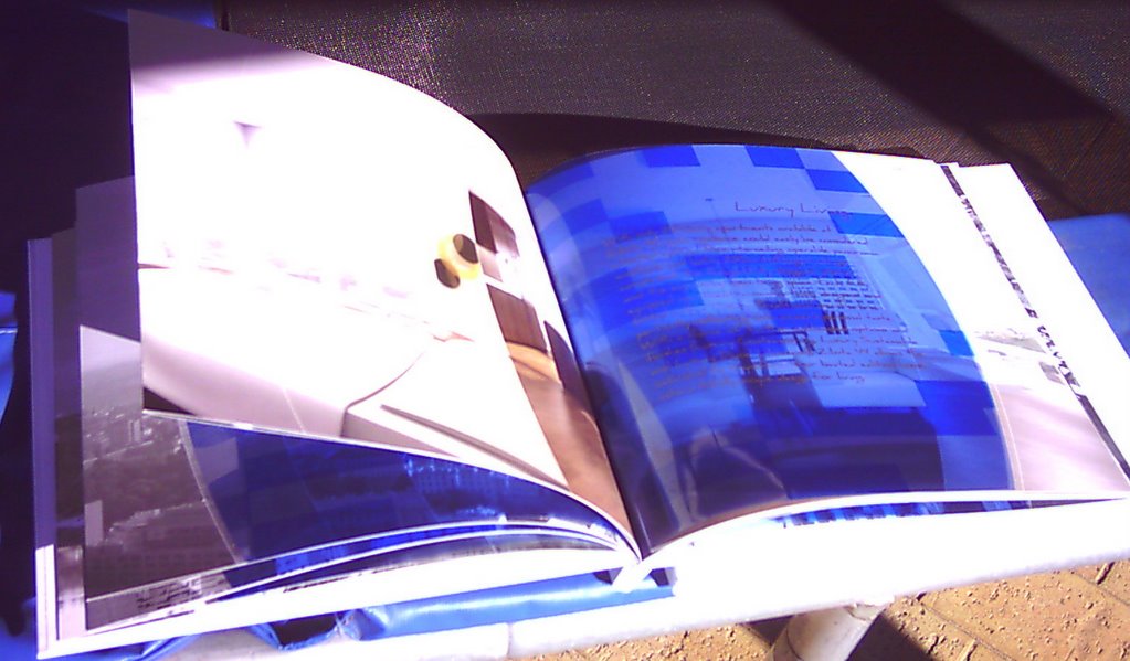
The pages fold out to reveal views of the Warsaw skyline, and my handwriting appears in gold on blue acetate, curved to reflect the arc of the sun, which matches the curvature of the building.

It’s a really beautiful piece. And as a bonus, no one is ever allowed to give me any crap about my handwriting ever again, ever.

As always, you can download the ‘Daniel’ typeface free from dafont.com.
1 January 2007 at 7:45 pm
Ooooo, very fancy.
But don’t forget that “Daniel” also appeared in the graphics I created for The Rocky Horror Show. Which was less sophisticated and more, how you say, crotchy.
A tribute to its versatility.
2 January 2007 at 12:07 pm
I’ve got it and it was used as the font of choice for out street party invitations.
17 May 2009 at 7:58 am
I’m almost ashamed to admit it to you, an expert in language and writing…but, I write for a blog. I was in Flickr labeling my photos with Arial when I felt tempted to use Daniel. That’s how I happened upon your font. It’s beautiful. So, I couldn’t use it to label my pictures, lest it take attention away from my ‘works of art’. Why did anyone ever give you “crap” about it, anyhow? I have always wanted to develop my own font. Do you have a post about the process?
All the best and compliments on your font. The blog appears to be quite ‘entertaining’, as well.
RJ at SheepsheadBites.com