I like to point out good typography and design when I see it, and I’ve developed a man-crush on the poster for the film ‘The Good Shepherd’. It’s been popping up on bus stations around Perth, and it’s a masterful piece of work.
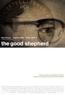
I don’t mean this poster, which is running in the USA:

although it’s good too. Notice how dramatic whitespace can be.
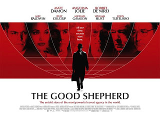
Here’s the Australian one, flattened for landscape orientation.
The first thing is the typography. They’ve used Optima, designed in 1959 by the inimitable Hermann Zapf. It’s simple, clean, unassuming, and perfect for the time in which the film was set.
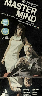
Second is the globe with the actors’ faces. This kind of international look was all over the place in the 60s and 70s. It’s very UN. For some reason it reminds me of the original cover on the box of the game ‘Mastermind’.
Again, the whitespace is easy on the eye, though the effect is more pronounced for the portrait version.
Overall, the poster looks global, sophisticated, and commands attention without being garish. It’s perfectly in keeping with the mood and time of its subject matter. Just a nice piece.


8 February 2007 at 11:20 pm
I have the Mastermind game with that box cover.
I think the similarity is to do with the way the top 3/4 bleeds into the bottom – in the film, it’s the central figure’s legs and in the box it is the reflection.
11 February 2007 at 1:40 pm
Love the Master Mind box.
I think it was the first time I noticed that Asian women were… um… of interest to me.
In fact, I think that unnamed model would have to be on the list of Hottest Asian Women in History, way above Lucy Liu, and maybe just a bit above Sandra Oh.
I do not have such a list.