My fonts have turned up in the strangest places. Rosa’s Lounge still uses the ‘Daniel’ typeface. If you click the link, you can see their ‘Tribute to Sunnyland’ poster on the door — that’s my handwriting. They even used it on their very fine t-shirts. Once in Barcelona I saw a guy wearing the Rosa’s t-shirt coming off the subway. I wanted to say, “Hey! That’s my handwriting!” but how do you say ‘handwriting’ in Spanish? Or should I try Catalan? I don’t even speak freaking Catalan. And what would you say if someone accosted you on the subway, pointing at your shirt and babbling incomprehensible gibberish?
Me: That is my sign.
Him: What?
Me: Sign! Pencil! I did that!
Him: You want my shirt?
Me: No! I wrote on your shirt! Writing! It is a club of music in Chicago!
Him: Are you okay?
Me: Oogy! Oogy boogy! BOOOOOO-GYYYYYYY!
It was the conversation I was destined to have. But indecision held me for that one fateful moment, he and the shirt were gone, and I was another stranger in the Barcelona subway forever doomed to be misunderstood.
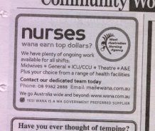
 Now in this morning’s paper, I see that the West Australian Nursing Agency has used the very clean and sober ‘Perspective Sans’ typeface. I created it when I was young and foolish, and didn’t know my german-double-s from a hole in the ground. I’m pleased to say that I included all the accented characters, though, as well as a very fine Euro, and all in three weights with an italic companion.
While the WANA may lack the cultural cachet of Chicago’s Friendliest Blues Lounge (don’t we all?), nurses are generally solid citizens, important to the community, and have — dare I say — a certain clinical allure. You may join them in the celebration of fine typography by downloading Perspective Sans from dafont.com.





Recent Comments