Good Reason

It's okay to be wrong. It's not okay to stay wrong.

Category: typography (page 3 of 3)

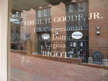
Bigot’s office spray-painted: Goode.

You may have heard of Virgil Goode (R-Va). He’s taken on Keith Ellison, the Muslim congressman who used Jefferson’s own Koran for his private swearing in. Goode is responsible for writing this piece of asshattery to a constituent:

if American citizens don’t wake up and adopt the Virgil Goode position on immigration there will likely be many more Muslims elected to office and demanding the use of the Koran. We need to stop illegal immigration totally and reduce legal immigration and end the diversity visas policy pushed hard by President Clinton and allowing many persons from the Middle East to come to this country.

And so on.

Well, it seems that Goode’s office has been vandalised, though it’s doubtful that the vandal did more damage to Goode’s office than Goode himself. To wit:

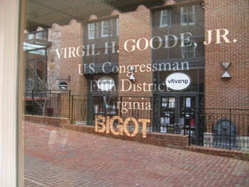
As much as I like a good bit of culture jamming, I really can’t condone this act of vandalism. In fact, I find it deplorable. There’s really no excuse for what this stenciler has done. I mean, look at it. Mixing serif and sans-serif within the same block of text? You must be mad!

Next time, make sure that you use Caslon and not Helvetica:

It’s just as easy to get these things right the first time.
‘Daniel’ typeface graces architectural advert

I have just received an advertisement in the mail, if you can call a beautifully bound book an ‘advertisement’. The ad’s for Zlota 44, a residential skyscraper that is soon to tower over the Warsaw skyline. The folks at EuroRSCG Marketing have chosen my handwriting typeface ‘Daniel’ for the body text.

The pages fold out to reveal views of the Warsaw skyline, and my handwriting appears in gold on blue acetate, curved to reflect the arc of the sun, which matches the curvature of the building.

It’s a really beautiful piece. And as a bonus, no one is ever allowed to give me any crap about my handwriting ever again, ever.

As always, you can download the ‘Daniel’ typeface free from dafont.com.

That’s quite the stick on that figure.

The importance of knowing your typography:

School officials apologized after an X-rated font was used on a third-grade spelling packet handed out to parents. The font showed male and female stick figures in provocative poses to form the letters of the alphabet.

The font in question is, of course, the infamous GroupSex.
From the local paper:

Sources said the teacher had no idea the alphabet was offensive when she downloaded the font from the Internet. It’s unclear if any disciplinary action has been or will be taken against the teacher, who sources said has been with the district for many years.

“I definitely believe it was a mistake,” said Kelly Stegmann, Pine Tree Parent Teacher Association president. Stegmann said she received very few calls from parents about it.

Mistake? The teacher failed to notice that she was downloading and installing a font called ‘GroupSex’? And then chose it from the menu, not realising that she was choosing a font that said ‘GroupSex’? Is this like the ‘mistake’ I made when I downloaded 1,500 pictures of breasts, without realising what I was looking at?

No, if you’re going to do erotic typography, you do it properly and unapologetically. In fact, I recommend ‘Vintage Erotique‘.
Now that’s worth giving to parents.

Font fame

That ‘Daniel’ font pops up in the strangest places. It’s my handwriting font that I created long ago, and released to the web.

‘Daniel Bold’ now appears as the title font on the poster for a major motion picture. The film is “48 Shades“, an adaptation of the Nick Earls book.

It takes a lot of people to put a movie together, and I like to think I’m just doing my part. You can download the Daniel font from dafont.com.

Newer posts

© 2024 Good Reason

Theme by Anders NorenUp ↑