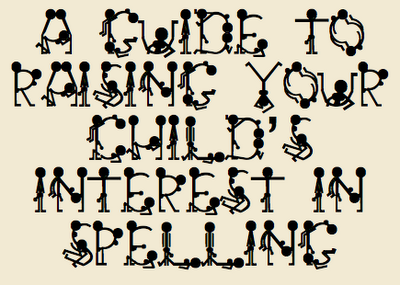
The importance of knowing your typography:
School officials apologized after an X-rated font was used on a third-grade spelling packet handed out to parents. The font showed male and female stick figures in provocative poses to form the letters of the alphabet.
The font in question is, of course, the infamous GroupSex.  From the local paper:
Sources said the teacher had no idea the alphabet was offensive when she downloaded the font from the Internet. It’s unclear if any disciplinary action has been or will be taken against the teacher, who sources said has been with the district for many years.
“I definitely believe it was a mistake,” said Kelly Stegmann, Pine Tree Parent Teacher Association president. Stegmann said she received very few calls from parents about it.
Mistake? The teacher failed to notice that she was downloading and installing a font called ‘GroupSex’? And then chose it from the menu, not realising that she was choosing a font that said ‘GroupSex’? Is this like the ‘mistake’ I made when I downloaded 1,500 pictures of breasts, without realising what I was looking at?
No, if you’re going to do erotic typography, you do it properly and unapologetically. In fact, I recommend ‘Vintage Erotique‘. Now that’s worth giving to parents.

2 November 2006 at 4:24 am
Well you know your pervy friend Jeff found the Vintage Erotique font about 2 seconds after downloading your fonts, but I knew what I was downloading. Has already made for some great party invitations.
2 November 2006 at 8:48 am
That’s very amusing – I love fonts and agree it’s highly unlikely to have been a ‘mistake’. I particularly like the N as it’s such a polite approach to the task in hand. If you wrote HAHAHAHAHAHA you’d get animation.
2 November 2006 at 9:04 am
‘N’ is great, but I think you’d have to be lying on the floor and not standing. Come to think of it, this is probably true for most of the characters.
If it was a mistake, it bespeaks a level of cluelessness difficult to find outside of Kansas.
I’ve never been invited to a Vintage Erotique party. What would the decorations be like?
“My, what interesting huge wrought-iron letters you have scattered around the place!”
2 November 2006 at 2:03 pm
aha, a new and amusing way to procrastinate, downloading sex fonts!
I wouldn’t put it past someone to be that stupid… seriously, so many stupid people in the world… unfortunately not only in Kansas
2 November 2006 at 9:43 pm
I’ve just looked at that N again with my stronger glasses on and I realise it’s a person with someone over their shoulders!! I thought it was one person giving another a very polite handjob (the recipient having very large balls!!) The mind boggles!
3 November 2006 at 6:09 pm
I (Little Red Riding Hood) would never have imagined that people had such weird ideas. D.’s post and your comments are really funny but the alphabet, well, I don’t find it much exciting…